With the Academy Awards for the year just around the corner, it’s time to reappraise the best that cinema had to offer in the previous year. After a disappointing year at the movies in 2020, 2021 offered a lovely mix of films in terms of content, form and genre. From indie powerhouses to science fiction epics, directors and cinematographers brought distinct visions to life on the big screen. Film lovers were spoilt for choice, as beloved powerhouses like Guillermo del Toro and Pablo Larrain came out with new projects, right alongside daring new ventures by newcomers like Maggie Gyllenhaal, and international veterans like Ryûsuke Hamaguchi.
Be it the singularly quirky black-and-white vision of Wes Anderson in The French Dispatch or the brooding, neon affected visuals of body horror flick Titane, there was a vast palette of aesthetic and formal convention for cinephiles to choose from. Without much ado, let’s take a look at some of the best shot films of 2021, and what made them so special.
Watch: Blade Runner 2049 Explained
1. Dune
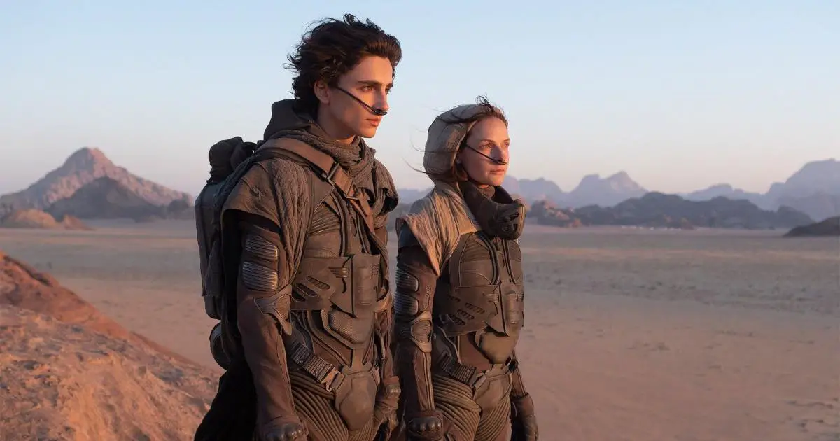
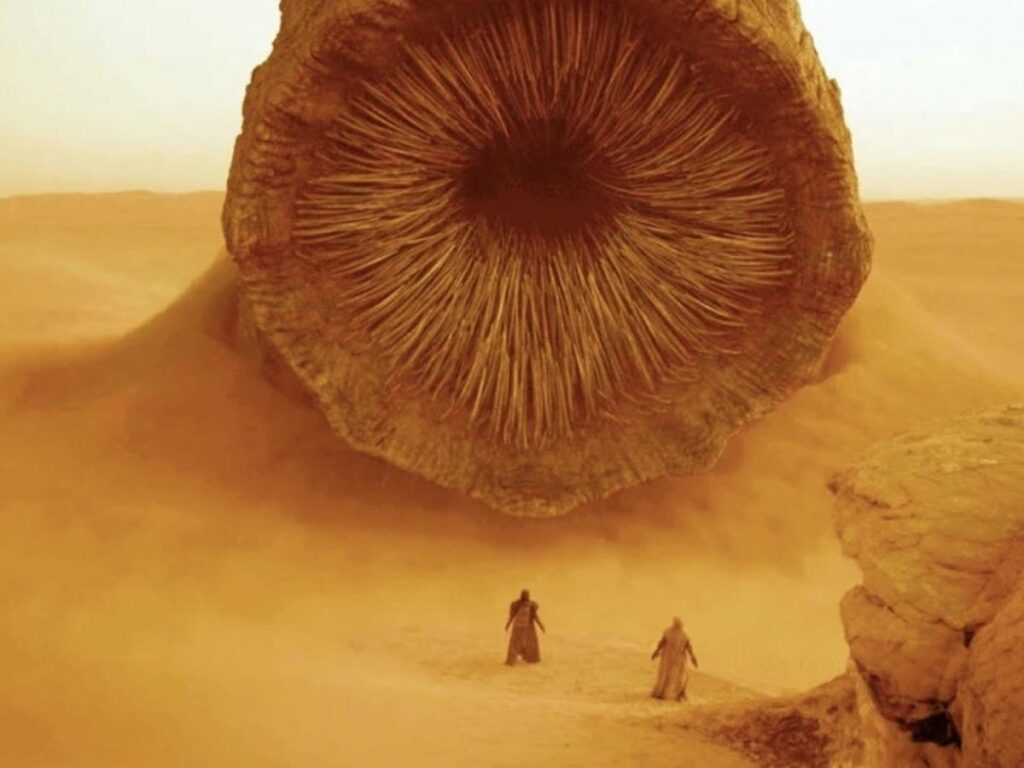
No one does a sci-fi film quite like Denis Villeneuve. In the era of MCU fueled CGI banality, his films like Blade Runner 2049 and Arrival have had some of the most stunning imagery in the genre in recent years. In his collaboration with Greg Fraiser, Dune exhibits a return to the epic imagery of science fiction cinema that seems straight out of a spice-fueled dream. Rolling sand dunes and dusky skies awash with natural light inform the visual landscape of the film, which is an epic saga of war and betrayal set in futuristic space.
Frasier’s eye for sparseness and minimalist beauty allows the film’s vast expanse of sand and sun to come to life, and feel immersive to the audience. He sums up his penchant for creating real and natural looking scenes for the film succinctly:
“We were just replicating the real world, and it looked amazing.”
Dune 2 Review: A Fantastic Return To Another World
2. The Power of the Dog
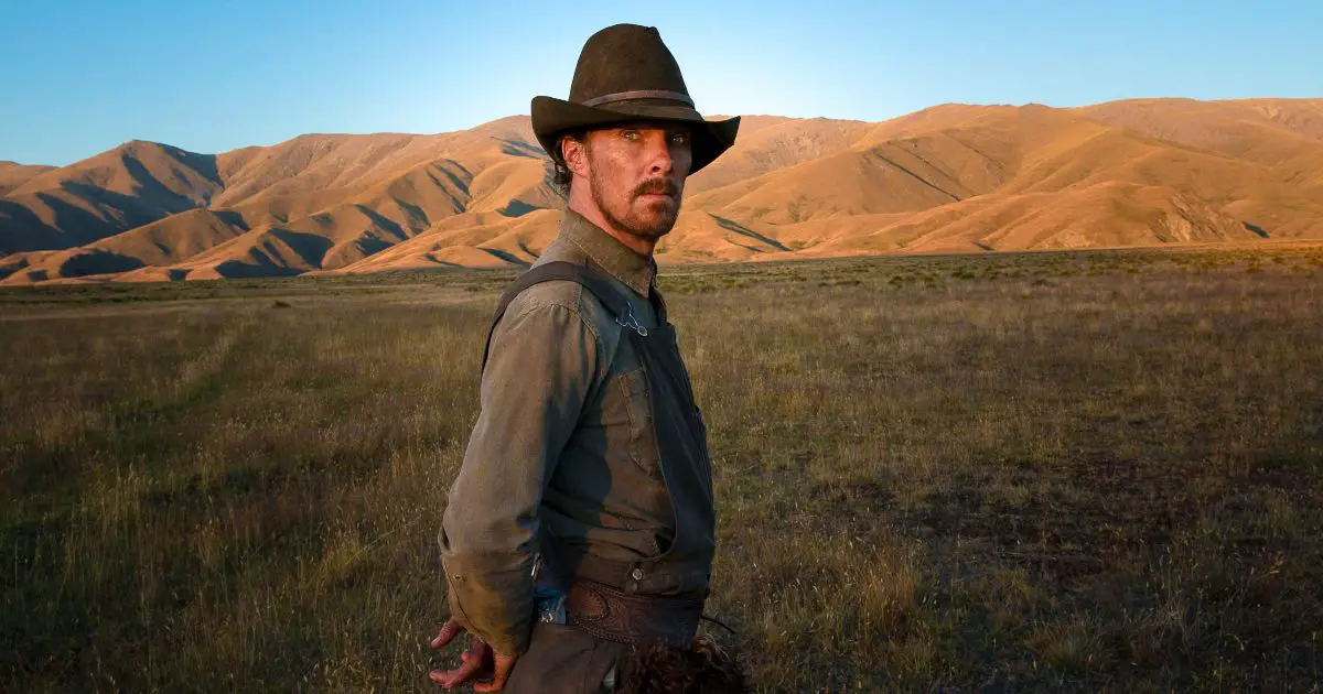
Jane Campion’s first film in nearly twelve years, The Power of The Dog is a spectacular ode to the rolling hills and valleys of cowboy westerns. Cinematographer Ari Wegner describes the film as a removal from the genre in terms of its tone and texture. Substituting New Zealand for the stunning vistas of rural Montana, the film captures a robust, earthy aestheticism offset by plenty of natural light.
One of the most striking things about the film is its use of muted colors to create a sense of intimacy and realism. Neutral tones combined with soft lighting for the interiors and the blazing sunlight in the exteriors lend the film a rich texture of space. Campion and Wegner’s usage of light and shadow lends visual heft to a story of a flawed man grappling with dark secrets.
3. Nightmare Alley
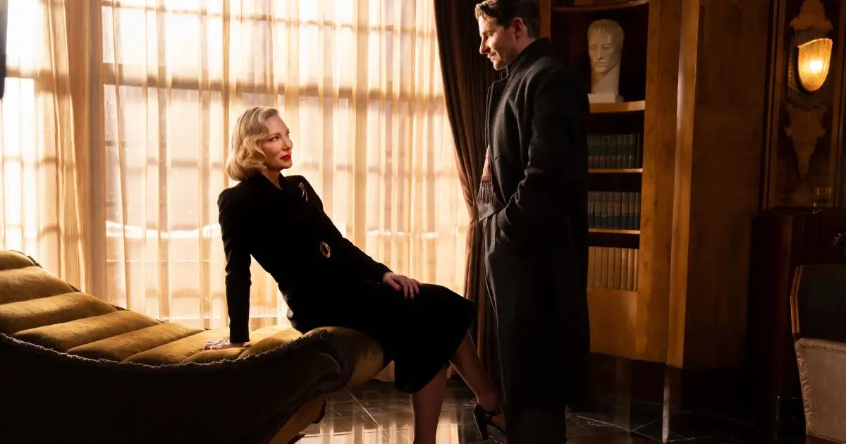
Nightmare Alley evokes the stark visual style of early noirs, which manages to be evocative of its period setting while also making use of modern cinematographic techniques such as deep focus. The cinematography contains several subtle references to other films from 1940s cinema that may only be noticeable for those familiar with that era. Shot on 35mm film stock with anamorphic lenses, the film sought to produce visuals that were reminiscent of films from the period they were set in. This would help to make it look like it was made at that time rather than today.
Many shots were lit using practical lighting sources such as lamps or car lights; this had to be done carefully so that these did not create too much contrast and blow out the highlights. Guillermo Del Toro’s propensity for crafting hauntingly beautiful mysteries is offset by the cinematography style, which engages the audience in a game of light and shadows.
4. The French Dispatch
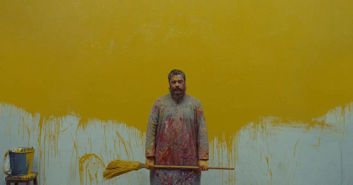
With a unique style that is unmistakably Wes Anderson, the very first shots of The French Dispatch transport us to a charming and whimsical world that feels like an old story come to life. The camera constantly moves and spins around its subjects, creating an immersive experience that draws us into the story.
One of the most interesting aspects of cinematography by Robert D. Yeoman, who has shot most of Anderson’s films, is the use of color. Each scene has its own unique palette, ranging from muted earth tones to bright and vibrant hues. Notably, its three stories are told in black and white, with the interludes in color. This helps to create a varied visual landscape that never becomes dull or repetitive.
Anderson’s meticulous attention to detail ensures nothing feels out of place; it all contributes towards creating a microcosm that feels cohesive and complete.
5. Memoria
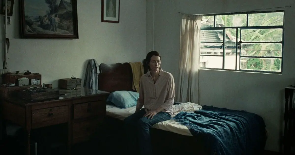
Memoria weaves a surreal spell over its audience, thanks to a number of trademark cinematography techniques used by director Apichatpong Weerasethakul. One such technique is the use of static shots, which creates a sense of stillness and tranquility. This is in contrast to the more typical kinetic cinematography seen in most films, and helps to create a dreamlike atmosphere. Another common technique used by Weerasethakul is the use of long takes, which allows viewers to take in the entire scene and appreciate the beauty of the location. This also contributes to the dreamlike atmosphere present in Memoria.
Finally, Weerasethakul and cinematographer Sayombhu Mukdeeprom often use deep focus cinematography, which results in intricate details being visible in the background and foreground of each shot. This goes wonderfully well with the film’s narrative of fantasy and mystery, creating an expressive beauty and immersing viewers in the world of the film.
6. Passing
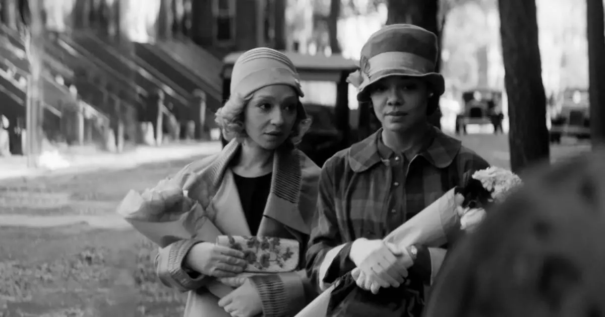
If you’re looking for a thought-provoking indie drama with beautiful visuals, Passing is worth checking out. The film creates atmosphere and meaning without distracting you from what’s happening on screen. It has a rather ethereal, dream-like quality to it, which helps to convey the film’s themes of identity and deception. The camera often lingers on shots for longer than usual, creating a sense of intimacy between the audience and the characters.
This helps plant plenty of subtle visual clues throughout the film. These subtle visual motifs tie together the themes of racial justice, envy, loss and identity. The cinematography makes very good use of wide shots and deep focus to immerse the audience in the world of these characters. Passing is a great example of how cinematography can be used to create meaning within a story without being distracted from it. The 1920s-inspired ambience and the heavy subject matter are never at odds. Instead, they complement the storytelling process.
7. The Tragedy of Macbeth
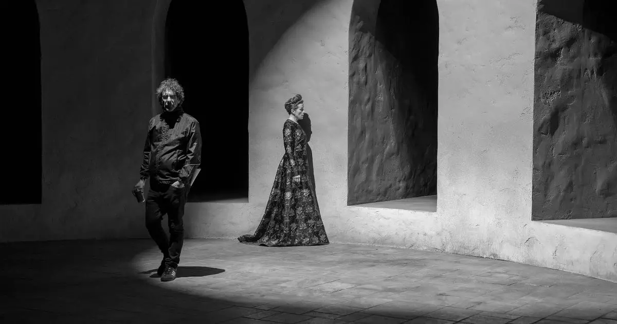
Perhaps no dramatic work has been adapted as often, or with as much variety, as Shakespeare’s Macbeth has been on the big screen. In Joel Coen’s The Tragedy of Macbeth, the familiar themes of ambition, downfall and madness are lavishly bestowed a noir-ish turn of thrill and unpredictability. A hard thing to pull off with a famously iconic text, but the film succeeds.
One of the most striking things about The Tragedy of Macbeth is its use of color, or rather the lack of. Coen has said that he wanted to create a “graphic and painterly” look, and this is evident in every frame of the film. Shot by Bruno Delbonnel, who also directed the Coen brothers’ Inside Llewlyn Davis, the film’s palette is not merely black and white. Instead, various tones of gray come alive with shadows, which give the movie a cold, dark atmosphere. This is particularly effective in scenes where Macbeth is contemplating murder, reinforcing his descent into insanity and darkness.
Delbonnel’s work in the film prioritizes aesthetic value over formal convention to convey the inner thoughts of the characters. Most memorably, when Macbeth sees Banquo’s ghost, a series of disorienting close-ups convey his deteriorating state of mind. This expressive use of abstract visuals to convey sentiment keeps alive the theatricality and ambiguity of both the original play, and Joel Coen’s interpretation of it.
8. What Do We See When We Look At the Sky?
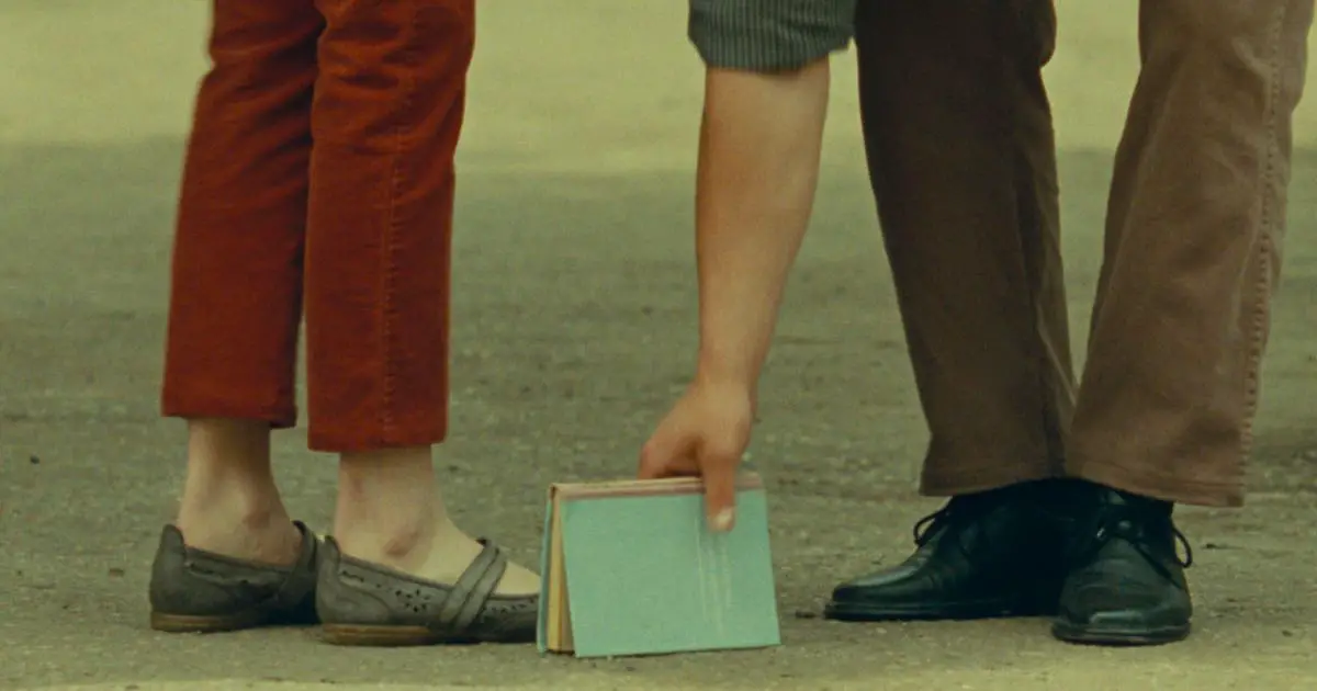
With a haunting surrealism that is reminiscent of European cinema in the 1920s and the playful artistry of New Wave Cinema in the 50s, What Do We See When We Look At the Sky is a film that is all about the gaze. It is then no surprise that the cinematic gaze of this work is thoroughly distinct, which is largely static and realistic. This style helps to create a sense of intimacy with the characters.
Although there are moments when the film makes use of long camera movements, they are still well-integrated into the film’s overall cinematography style. The choice to use static cinematography creates a sense of realism.
In addition to the cinematography, director Alexandre Koberidze also uses naturalistic lighting throughout most of the film. Coupled with a largely organic setting, the duality of motion and stillness lends a lovely atmosphere to the film. It is not uncommon for cinematography to be exaggerated in order to convey a certain emotion or tone, but this understated elegance stands out as distinctly realistic, while still conveying a heightened emotional experience.
9. The Worst Person in the World
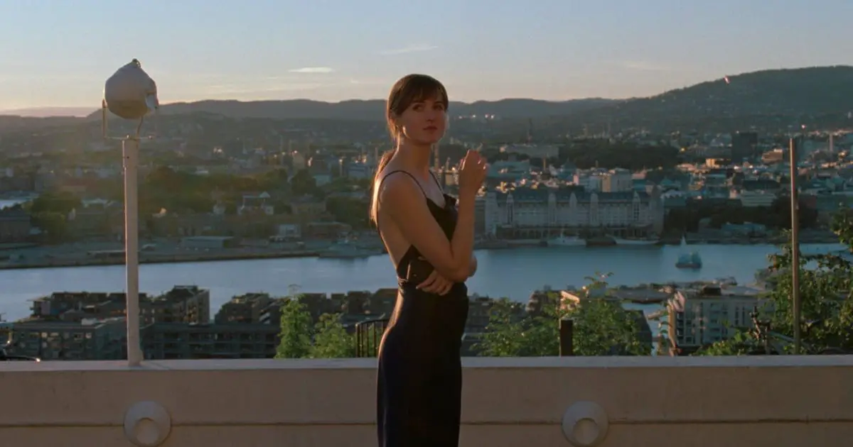
The third film in Joachim Trier’s Oslo Trilogy, The Worst Person in the World narrates a story of love, loss and life in twelve chapters. Just as the phases of Julie’s life seamlessly merge into one another, so does the style of cinematography employed by Kasper Tuxen. To tell a story that focuses solely on the solipsistic worldview of the main character, the camera frames her front as center at all times. Smooth and fluid shots with a minimum of fuss and flair make for an enjoyable viewing experience that allow us to empathize with flawed characters.
With a wonderful usage of light, the film breathes life into the modern landscape of Oslo, highlighting its sophistication through a barrage of coffeeshops, nightclubs and galleries. There are some amazing scenes that make great use of light streaming through windows or doorways, casting beautiful patterns on the walls or floors. In other scenes, Trier makes effective use of darkness to create an unsettling atmosphere of emotional distress. This really helps to convey the mood and tone of the film perfectly, a fitting love letter to the austerity and brutality of modern life and relationships.
10. Drive My Car
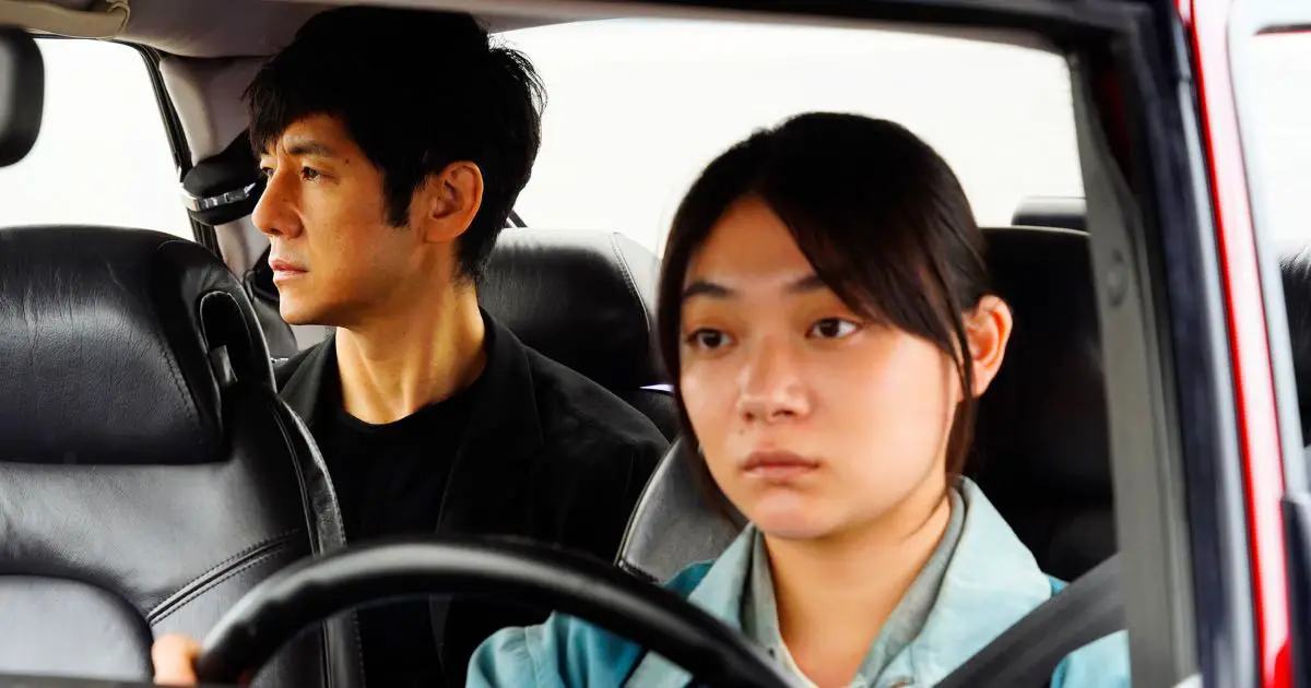
Based on a short story of the same name from the collection Men Without Women by Haruki Murakami, Drive My Car presents a story loss and coping with startling naturalism. One of the most effective qualities of the film’s cinematography is its understated, contrarian use of color. Drive My Car uses a lot of muted colors throughout, which help emphasize both calm and bereavement. This is particularly evident in scenes where we see characters driving or walking around town; everything has a soft, dreamy quality to it.
Captured through the lens of longing, everything seems slowed down and blurry. Cinematographer Hidetoshi Shinomiya uses this quality to greatly enhance the frantic motion and energy of the cityscape.
With a perfect blend of motion and stillness, the film elevated vehicles to the medium of emotional experiences. With frames where the bright red of the titular car is brilliantly contrasted against the tranquil, redolent even, landscape of suburban Japan, Drive My Car is an unmissable paean to visually expressive, yet seemingly effortless, cinema.
11. C’mon C’mon
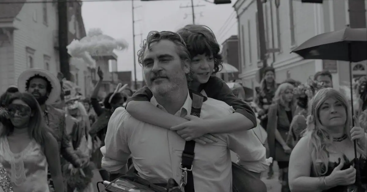
Mike Mill’s black-and-white cross country road trip film delving into family drama is nothing if not immaculately clinical in how it frames its two protagonists — Johnny, a mild-mannered interviewer and his nephew, Jesse. Using a black and white format really allows the film to strip down to its essentials and focus on the central relationship between two misfits.
Cinematographer Robbie Ryan’s expertise in creating rich imagery full of shifting light and texture (as seen previously in 2018’s The Favorite) is put to good use by Mills, who was interested in creating a parallel story that referenced the documentary genre as well as a child’s story.
12. Bergman Island

Shot on a small island off the coast of Sweden where director Ingmar Bergman spent his last days, Mia Hansen-Løve’s Bergman Island is a thought-provoking study of solitude and personal demons. Lensed by Denis Lenoir, the film uses the camera to provide perspective on events instead of merely recording them. Viewers may note the slow push-ins, medium shots interspersed with close ups and multiple camera angles, that often serve to impart a clear-eyed, documentary-like feel to the film.
These cinematography choices might also be to show the vulnerability and rawness of the characters’ conversations. The camera frames them closely as they think about their own lives and Bergman’s, whose influence looms large. One such choice is the use of handheld camerawork, which lends a sense of immediacy and intimacy. One feels transported to the innermost lives of the characters, living their highs and lows right alongside them.
13. The Lost Daughter
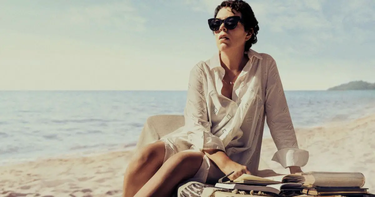
Maggie Gyllenhaal’s directorial debut, adapted from Elena Ferrante’s eponymous novel, is a gut-wrenching story of motherhood. The Lost Daughter explores this pain and grief through a lens that is not predictably dark, or gritty, rather astoundingly natural. Set amongst the sun-soaked beaches of Greece, the film switches between the warmth of natural light and a cold, almost blue palette for its twin narratives.
Shot by French cinematographer Helene Louvart, the film utilizes tight frames, handheld camerawork and crisp colors to their full effect. It gives us a narrative that is brutal in its emotional scope and clinical in its effect upon the audience.
14. Spencer
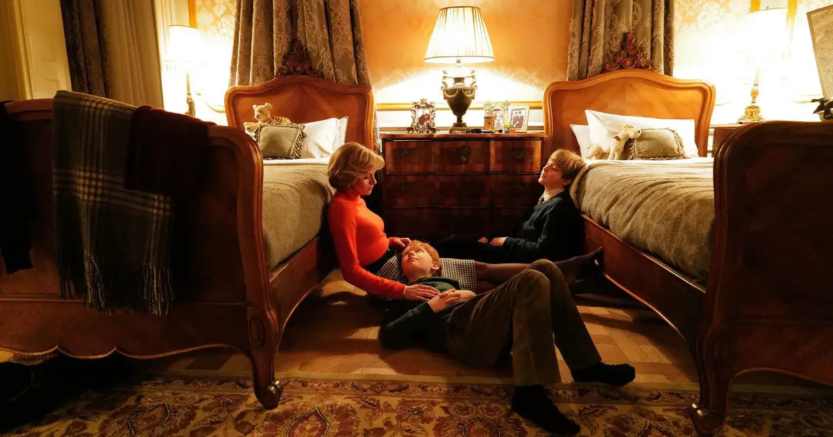
Acclaimed director Pablo Larrain is not interested in capturing the daily and detailed realities of the famous women whose biographic films he helms. What he so succinctly captured in Jackie (2016), is repeated once again in Spencer, a dramatized biopic on the life of Diana, Princess of Wales. This is in no small part due to the cinematography of Claire Mathon. She perfectly encapsulates the brooding, semi-gothic atmosphere of Larrain’s vision.
As with Jackie, and to a lesser degree, Ema (2019), Spencer revels in creating an experience full of surreal dream visions and maximalist imagery. Mathon’s eye for a blurry, romantic aesthetic (as seen in Portrait of A Lady on Fire) is at the height of its artistry. She creates an atmosphere of dread and claustrophobia through shaky camerawork, lingering close-ups and restricted light. The facts of the story may be exaggerated, but no visual piece is surplus to requirements in this self-described “fable from a true tragedy.”
15. This is Not a Burial, It’s a Resurrection
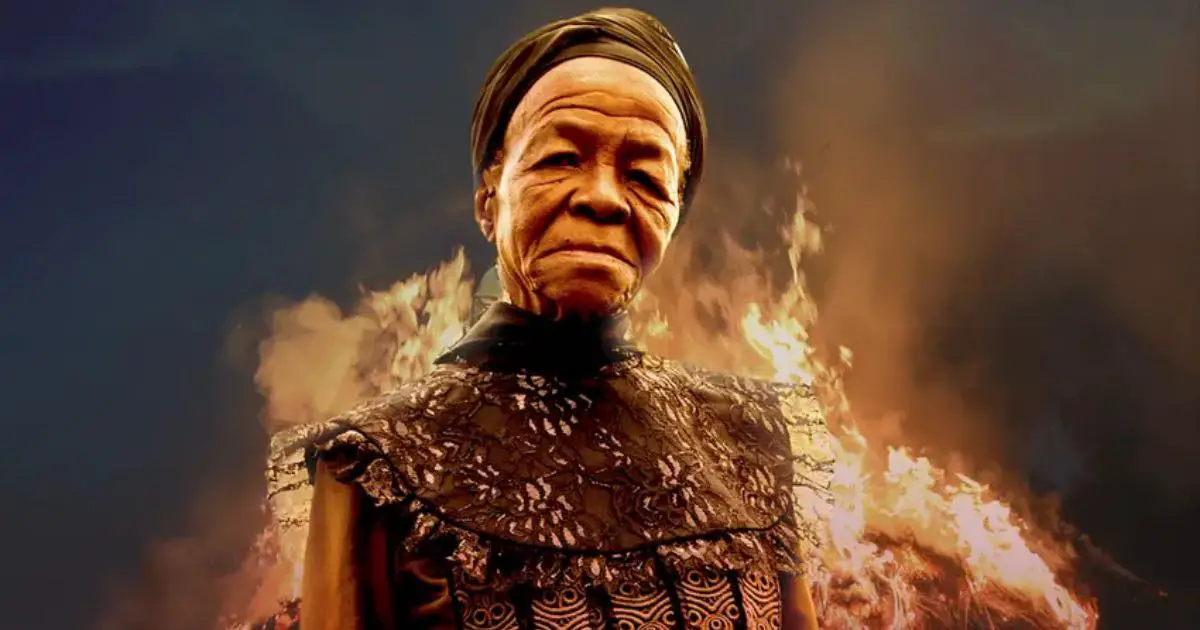
The cinematography style of This is Not a Burial, It’s a Resurrection is heavily reliant on static shots. Long takes are few and far in between; instead, the camera rests upon the subjects and captures the full extent of their performance. This gives the film a very deliberate, contemplative feel. It allows the viewer to take in the beauty of the setting and characters. The use of natural light is also key to creating an immersive experience; many scenes are shot outdoors or in open spaces which allow the light to flood in and create stunning visuals.
There is a great sense of visual harmony throughout the film, with each scene complementing the next. This creates a strong overall aesthetic, one that precariously rests upon the interplay between tradition and contemporary methods. The visuals alone draw you into the world of the story of a community struggling to do better.
16. The Hand of God
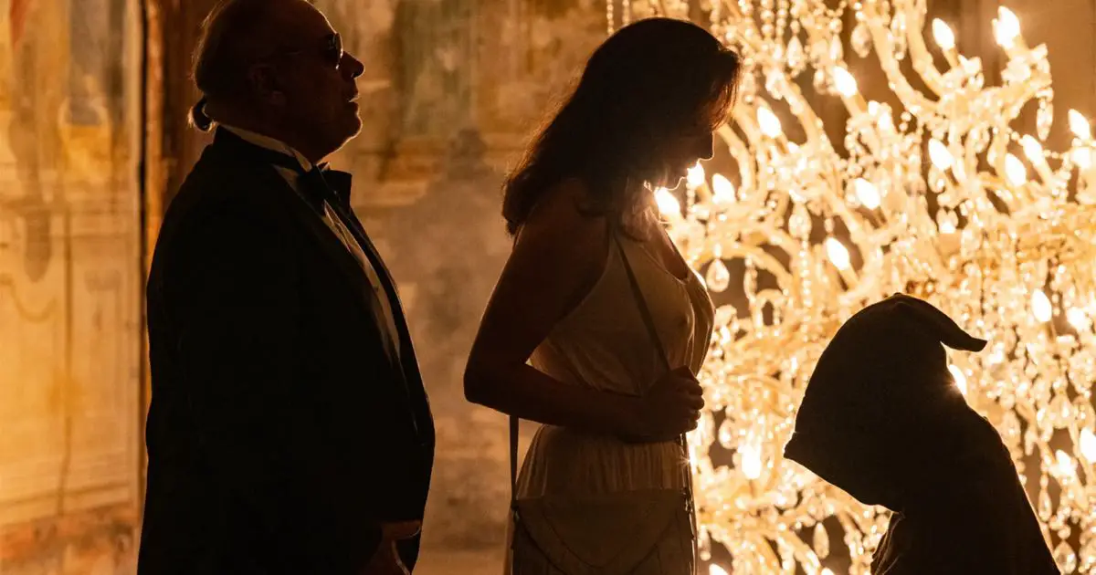
Coming-of-age stories set in the sunny throes of Italian summers are a cliche all their own. But, safe to say, Paolo Sorrentino’s offering is no formulaic fluke. The cinematography of The Hand of God is a beautiful mixture of classical and modern techniques. There are many wide shots which give the film a sense of grandeur and importance. This is particularly notable in the scenes featuring characters that the adolescent Fabietto looks up to. However, there are also plenty of handheld shots which create a more intimate feel. They help convey the chaotic nature of the young protagonist’s life.
More than anything else, the film evokes a swell of feeling for the city of Naples, be it through scenes where Fabietto first meets his love interest, Sofia, or frantic sequences that feature the young boy running for his life through the city. Overall, Sorrentino has created a visually stunning film that perfectly captures both the inherent romanticism and the chaos of coming-of-age.
17. Titane
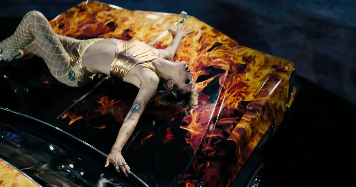
Extremes are commonplace in the shockingly violent and brightly lit visuals of Julia Ducarnou’s Titane. French for “titanium”, the controversial body horror narrative has been winning accolades for its inventive and boldness of perspective. Titane is an excellent herald of an approaching new idiom in experimental filmmaking.
One of my favorite scenes in the film is when Vincent breaks down and Alexia/Adrien cradles him. Awash with neon lighting and evoking the imagery of The Pieta, this entire scene may seem peaceful and serene (perhaps the filmmakers intended it to be), yet puts the audience on edge. It’s a great showcase of what Ducarnou and cinematographer Rueben Impens can do with their brand of cinematography that puts the body and its desires front and center.
18. The Souvenir Part II
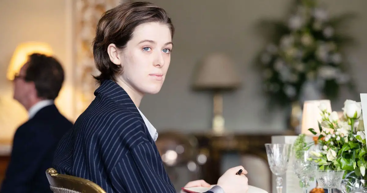
The much-anticipated sequel to 2019’s The Souvenir, the second part is a continuation that oscillates between memory and reality. The visual scope of director Joanna Hogg’s thinly veiled memoir takes after the cinematography style used in the first film. Cinematographer David Raedeker continues his use of natural lighting and framing that shows depth through camera movement. Most scenes are shot with a 50mm lens which provides an incredibly wide field of view. This interplay of stretch and distortion conveys a sense of distance from the characters’ inner lives.
Another key element to the cinematography is its use of ‘subjective’ technique such as point-of-view shots or extreme close-up shots. These techniques help give us insight into the thoughts and emotions of each character. We see what they see or what seems. For a film that is about multiple ways of viewing the past, this technique proves eminently effective.
19. The Green Knight
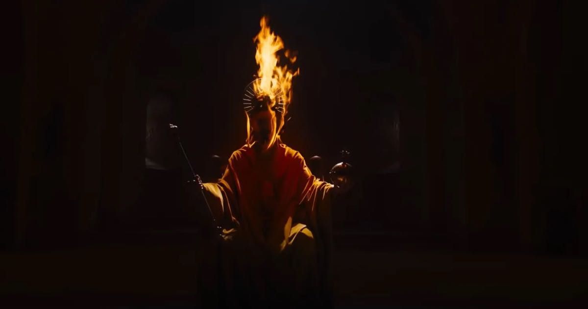
Adapted from the 14th century Old English poem Sir Gawain and The Green Knight, David Lowery directs a rustic vision of chivalry, honor and fantasy as seen in glacial tones of blues and greens. Andrew Droz Palermo, who previously worked with Lowery on A Ghost Story (2017), has lensed the film.
In The Green Knight he works to create an atmosphere that feels like Arthurian times, but with a modern cinematographic twist. He accomplishes this through blending two seemingly disparate styles of cinematography. The cinematography of big-budget, high concept fantasy epics and the cinematography of modern independent cinema. The camera moves slowly and subtly, capturing the beauty of the natural landscapes and the characters as they interact with their surroundings. This creates a sense of intimacy between the audience and the story, drawing us into the world of the film.
David Lowery has said that he wanted to make a film that felt like it existed in its own world, separate from our own. In this, he succeeds, for the film has a rich visual language that feels both timeless and contemporary.
20. Petite Maman
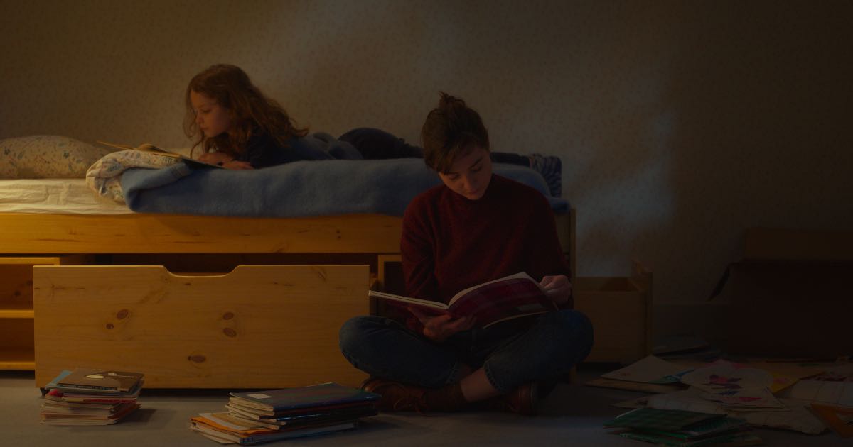
Petite Maman is a story about a young daughter, Nelly, who returns to her childhood home after losing her mother at the age of eight. The movie explores themes such as loss and grief, memory with some truly striking visual compositions. It features an array of carefully composed shots which are often static, but occasionally feature subtle camera movements. Cinematographer Claire Mathon makes great use of natural light in order to create a sense of intimacy and warmth. In terms of cinematographic apparatus, (not needed) Mathon makes use of 35mm cameras as well as digital technology. One particularly striking scene near the beginning of the film features Nelly lying in bed, with the sun shining through a window onto her face. This shot beautifully captures the innocence and vulnerability of childhood.
In one scene, Nelly is seen through the bars of a gate, creating an effect that emphasizes her isolation and loneliness. These shots create a sense of awe and wonder, serving as a visual metaphor for Nelly’s journey of self-discovery.
21. West Side Story
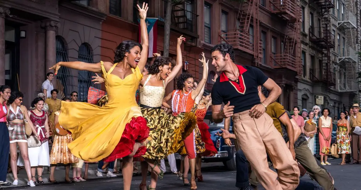
Janusz Kamiński and Steven Spielberg are well known for their genre-defining, iconic collaborations that have given us some of the best films of the century. After their work on Saving Private Ryan, Minority Report and War of The Worlds, the duo turned their sights on a remake of the acclaimed 1957 stage musical, West Side Story. Kamiński has said that they wanted to be faithful and pay homage to not just the Old Hollywood glamour of the first film adaptation of 1961, but also retain the Broadway roots of the original play. The result was fierce colors, golden lights and a sweeping vision of 60s New York that came to life to tell a story of unspeakable tragedy and young love.
The best part is that even when narrating seemingly mundane and banal events, the West Side Story utilises a colourful, almost theatrical effect that recalls to mind its stage origins. Grand musical numbers featured in the film are not interested in factual reality, but rather the emotion of it, with Kaminski proclaiming: “it’s a love story, why be too delicate and subtle?”
Conclusion
The extended pandemic seems to have had the effect of opening up audiences to newer, more experimental forms of storytelling. As cinema gears to pick up pace in the wake of the pandemic, there has been an increase in experimental films and niche subject matters. Not only that, even mainstream cinema seems to be poised for a more humanist, character-driven era of storytelling. A mode of storytelling in which the inner life of each and every fictional subject has the potential to be elevated to the stuff of cinematic legend seems nearer than ever, and I, for one, am excited to see what it holds.

