At the cinematographer’s roundtable hosted by The Hollywood Reporter this year, Roger Deakins said, “I do the job because I get emotionally involved in telling a story and helping a director tell a story about a real world, a real situation that has something to say.” Cinematographers, for most films this year, were driven to produce gripping stories, be it by working alongside these cinematic masters, or by elevating underrepresented women’s experiences, or even when recreating the exotica of Pandora. Their efforts should be applauded because every little rule in the cinematography playbook was quashed to embark on gutsy decisions.
These cinematographers embraced a wide range of genres, periods, subjects, themes, and settings, with a particular emphasis on subjects related to music, war, political concerns, social activism, and nostalgia, amongst others. Celebrated cinematographers from Janusz Kaminski and Claudio Miranda to ascendants like Ji-Yong Kim and Durald Arkapaw should be lauded for their masterly use of the camera to fulfill the director’s vision. Some breathed new meaning into the language of cinema, while others expertly tied together a theme or plot.
Here is a quick look at some of the best shot films of 2022.
1. Nope

Dutch-Swedish cinematographer Hoyte van Hoytema chose to use two camera systems, Panavision and IMAX cameras, to portray the spectacular and expansive environment of the film. He uses an unusual technique to capture the day-for-night shots. The nocturnal images produced on the screen create an unsettling feel while the exterior images composed of wide-open landscapes, a huge sky, and horses convey a sense of the grandeur of nature. Composed like a meticulously designed painting and rich in subtext, every frame of Nope is a visual spectacle.
2. The Batman

Australian cinematographer Greig Fraser borrows lighting methods from film noir to make this comic book adaptation an entertaining and enjoyable piece of pulp. To create a distinctive visual journey into the legend of Batman and his encounter with numerous rogues, Greg keeps the color tone saturated with a dusty and slightly unclean vibe. The innovative use of lighting, color grading, and anamorphic lenses helped create Gotham City of an ominous and vivid atmosphere. It is a city covered in saturation and darkness, and the way Bruce (Robert Pattinson) perceives the space as a pit of evildoers, dishonest coworkers, and dishonest superiors.
3. Decision to Leave
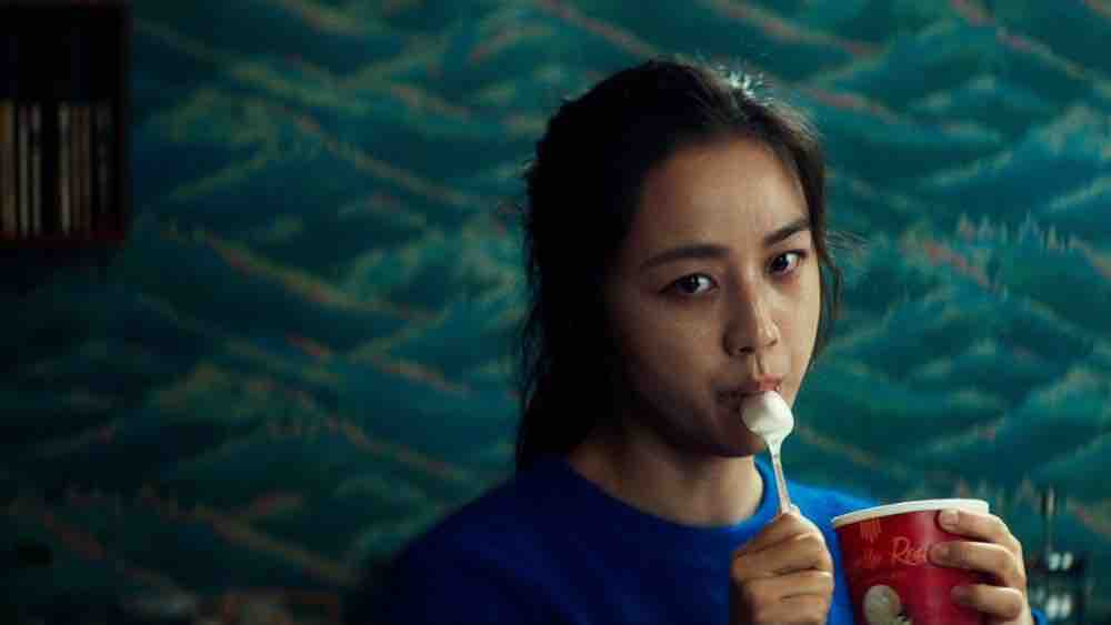
Ji-Yong Kim’s stylized cinematography and Park Chan-wook’s directorial command over the visuals keep us intrigued throughout this riveting, enigmatic piece of work. The cinematographic beauty of the film is achieved through meticulous framing that perfectly captures the tense mood and mellow moments. The first interrogation scene with the reflection of the characters in the mirror, the getaway sequence with the temple in the background, the mountain climbing scene, and the climax of the film on the beach are ample examples to prove how effective framing can add a vital dimension to the narrative.
4. Everything Everywhere All At Once
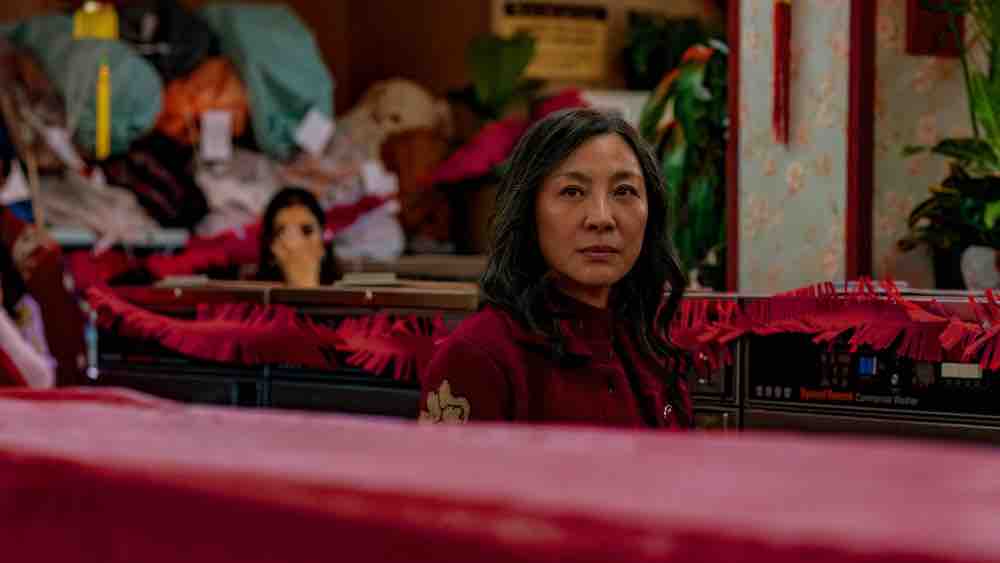
Larkin Seiple’s cinematography portrays each of the multi-universes with a style that is both stunning and frenetic. The visual transition not only appears to be physical but also emotionally puts us into the shoes of the protagonist Evelyn Wang (Michelle Yeoh). We are able to grasp her thought process even in the middle of intricately choreographed fight sequences. In the laundry scene, the camera tracks as well as simultaneously tilts to emphasize how Evelyn is a captive of her own world. We see the world through her eyes and focus on what is important to her, which makes the experience more immersive.
5. The Quiet Girl
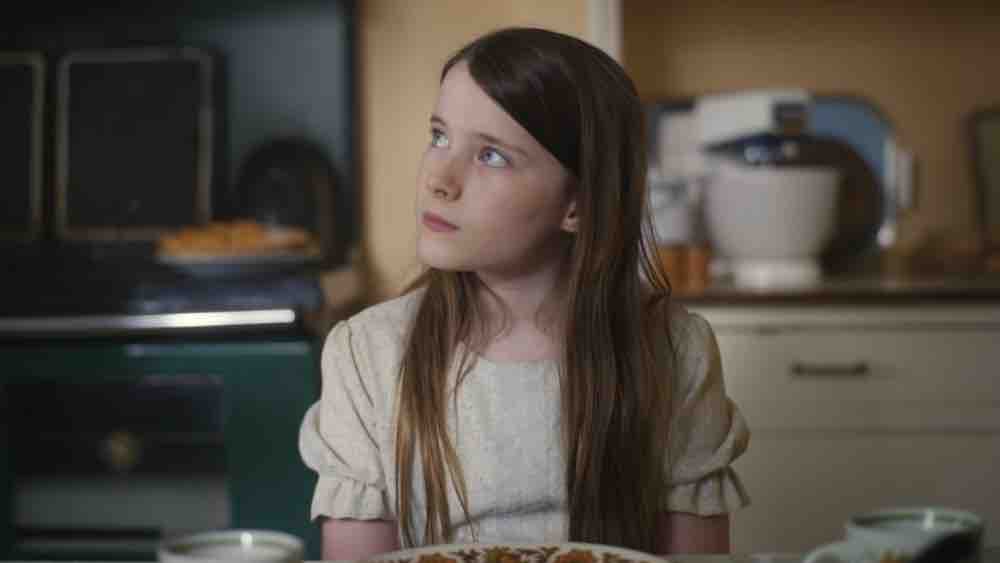
Set in 1981, the story charts the journey of the young protagonist Cáit‘s (Carrie Crowley) learning about the complexity of love and loss. Cinematographer Kate McCullough brings astute observations to film through Cáit‘s perspective by utilizing fluid camera movements, creative compositions, and the use of available light. The choice of a 1.37:1 aspect ratio symbolically indicates the boundaries that circle Cáit life. These are boundaries she must overcome and explore the world outside the frame that has yet to be discovered or even comprehended.
6. Top Gun: Maverick
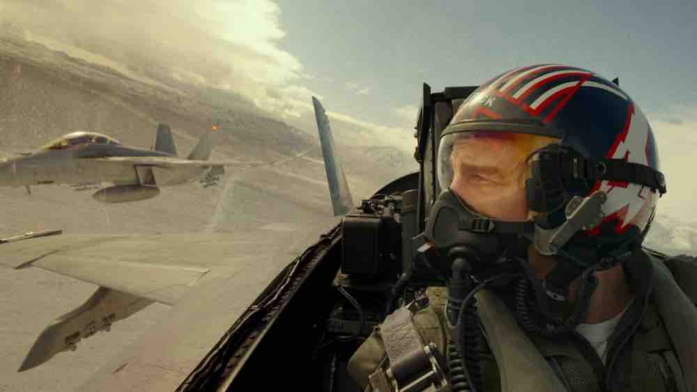
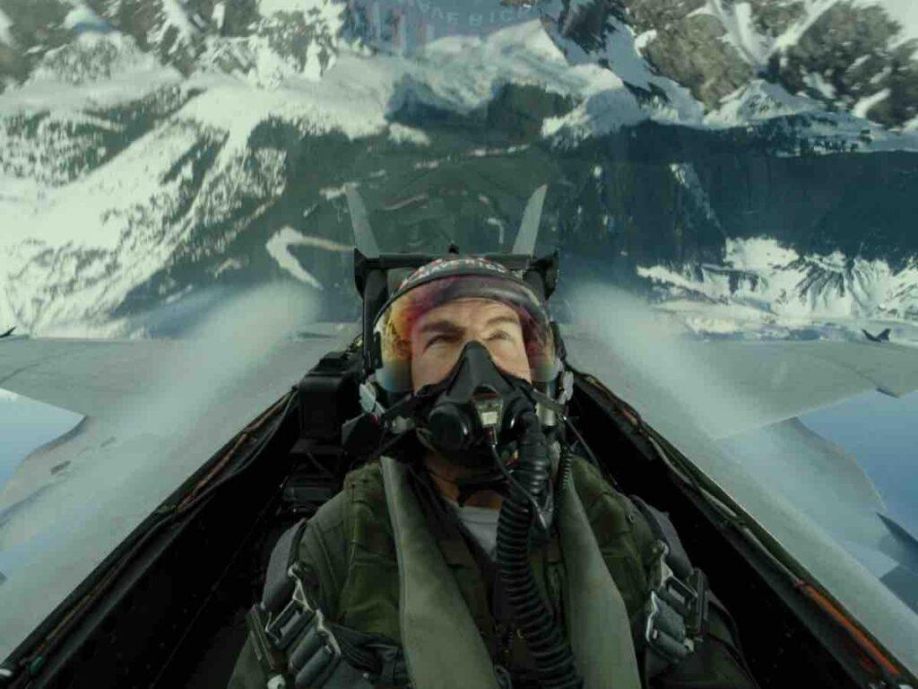
Thirty years after the first Top Gun (1986), filmmaker Joe Kosinski could only convince Tom Cruise to return for a follow-up if the film was actually shot in real jets. Cinematographer Claudio Miranda took aerial cinematography to a whole new level, putting actors and camera equipment right inside the cockpits of actual fighter jets. A specialized camera system of six Sony VENICE 6K cinema cameras was used for the purpose. The end result was a collection of authentic performances that CGI could never match. Dolly shots and intentional framing positions were used to recalibrate the cinematic barometer. Lower camera angles were used to show the group’s hierarchy as the pilots entered the scene. Maverick is always framed in either the foreground or background to let the spectator better understand the emotional beats of his journey.
7. Black Panther: Wakanda Forever

Durald Arkapaw’s cinematography gave a somber, melancholy look to the otherwise bright and shiny Marvel universe. She adds nuance and subtlety using innovative new cameras, lenses, and lighting schemes. She uses a wider lens for close-ups to accentuate the texture of grief throughout the film. She also uses lighting to enhance the mood and generate a feeling of naturalness. For the scenes set in Namor‘s (Tenoch Huerta) underwater kingdom of Talokan, the lighting is intentionally kept dark to create tension. The anamorphic lenses create a wider field of view of a world of water and add a nostalgic quality to the texture of the film.
8. Elvis

Mandy Walker utilizes camera movement to bring the much-needed dramatic impact in narrating the rise and fall of a legend. When Elvis (Austin Butler) is performing, the camera glides and dances with him. But during the dramatic scenes, the camera slows down to be more observational and empathetic towards the characters. The multi-saturated color palette in the film, resembling still photographs of the period, has been used effectively to emphasize different phases in Elvis’ career. In his Hollywood phase, the color becomes rich and contrasting. The Las Vegas phase used an anamorphic lens, which narrows the depth perception down to being very close to a character to help us feel what goes on in his mind.
9. The Whale

Matthew Libatique shot the film with a 4:3 ratio to allow the figure of Charlie (Brendan Fraser) to take up a larger proportion of the frame and intensify the drama. This in turn enhances the perception of his size and the entrapment he is in, both figuratively and literally. The story of The Whale takes place almost entirely in a tiny apartment over a five-day period. So, the light had different qualities depending on the day, and Libatique preferred to keep it subtle. Light and shadow help define the characters and their emotions, they never appear flat or dull.
10. All Quiet on the Western Front
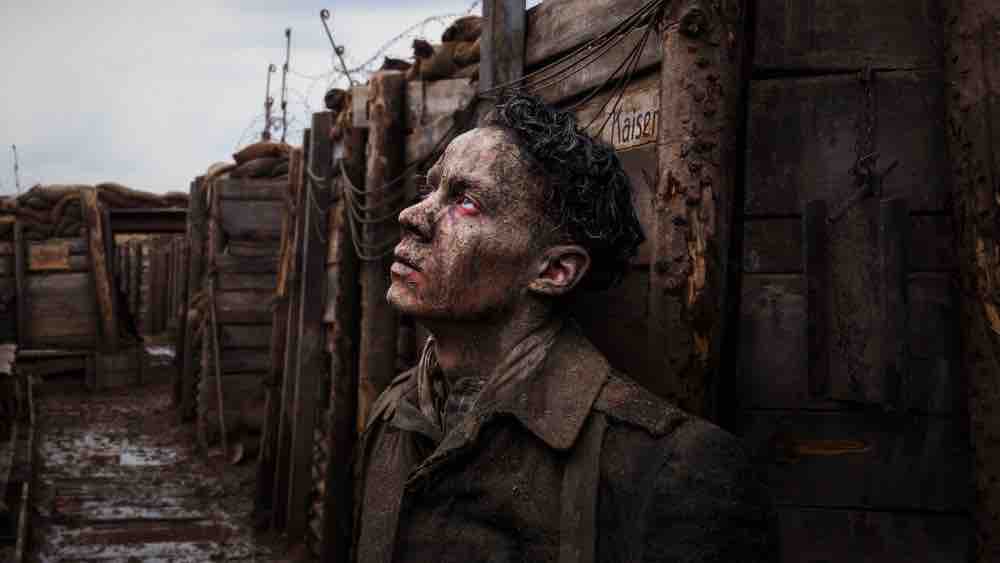
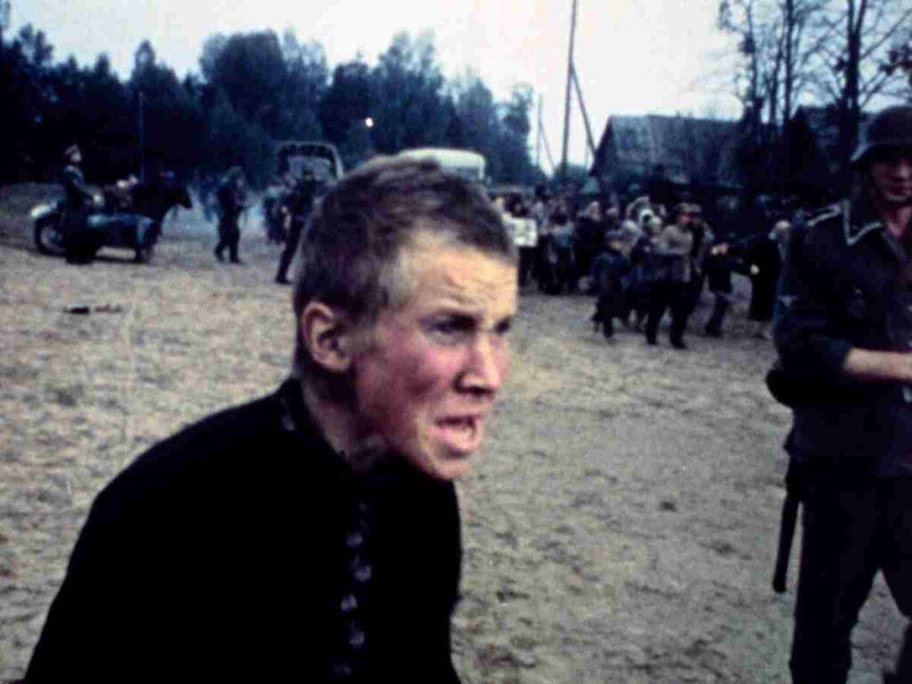
James Friend’s decision to use large-format cameras positions us directly in the trenches alongside the soldiers during World War 1. The color palette helped convey the journey from hope to futility of war. The film begins in winter with a blue-ish hue to emphasize the initiation of a journey. As we follow the soldiers into spring, we see a slightly more hopeful, almost childlike view of the world, where everything was clean and beautiful. The seasonal transition helps us understand what goes on in the minds of the soldiers and their perception of the world.
11. Babylon
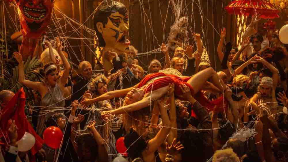
Linus Sandgren’s choice to add bold, vivid, and gritty contrast well illustrates Hollywood’s transition from the silent era to the talkies during the late 1920s. The bright and burnt-out color tone gives the impression of the desert as a hot and hostile environment. At the same time, the rich and sumptuous color in the scenes at the crazy parties looks appropriately decadent and in keeping with the moment. Such dynamic use of color aids storytelling while connecting us with the characters. There are moments where Sandgren goes handheld to give a very wild and rough look to the film.
12. Avatar: The Way of Water
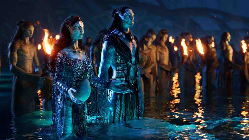
The epic action adventure combines astounding underwater cinematography and stunning visual effects. Russell Carpenter’s state-of-the-art visual approach and Cameron’s visionary direction create a compelling cinematic world. Pandora, the newly created alien planet, has a unique sense of depth and scale. The use of 3D technology evokes genuineness. The new underwater environment has a distinct color palette. Every frame is so richly detailed and immaculately composed, it’s hard to believe the universe of the film is digitally manipulated.
13. The Banshees of Inisherin
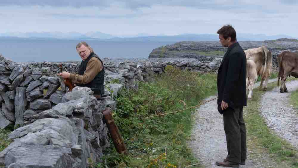
With an ethos, Ben Davis captures the isolation of the two long-time friends on a remote island off the west coast of Ireland in 1923. Be it in capturing the wild Atlantic Ocean or the quiet solitude of the island, there is poetry in every frame. The emotional aspect of every scene is captured with a striking visual texture that evokes a sense of loneliness. In one of the most remarkable scenes of the film, Colm Doherty (Brendan Gleeson) makes a confession. He is suffering from melancholia and despair, and the camera is placed very close to the character to put us in his shoes.
14. Corsage
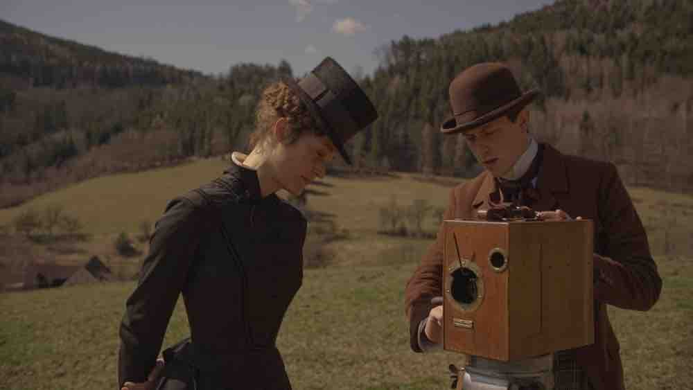
Judith Kaufmann shot the film on 35mm Kodak film, bringing out the flavor and authenticity of a period with remarkable use of lights, shades, and colors. The immaculate framing captures the symmetrical landscapes, overhead views of dining sets, and slow-motion shots of ladies climbing a staircase with myriad shades. She uses delightfully subdued color tones, including soft lavenders, silvery greens, and summer evening beige, to explore the protagonist Elisabeth’s (Vicky Krieps) sense of loneliness. She employs the camera as a tool to weave a visual tapestry of conflicting events, ideals, and obligations of a queen locked in a man’s world.
15. Empire of Light
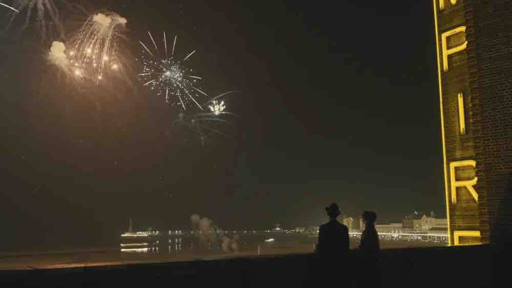
The story is set in the fall and winter of 1980–81 in the seaside town of Margate, Kent, around a palatial two-screen theater. Roger Deakins carefully directs our gaze and creates frames within frames using door and window frames, roof eaves, stairwell railings, and the lines of sidewalks and streets. He brings out the emotive texture of the film by lighting the scenes in silhouettes, long shadows, and high contrast. The lobby of the cinema is warmly lit at the start of the film to convey a welcoming space. But as Hilary’s (Olivia Colman’s) psychological state takes a toll, the lighting becomes harsher.
16. Triangle of Sadness
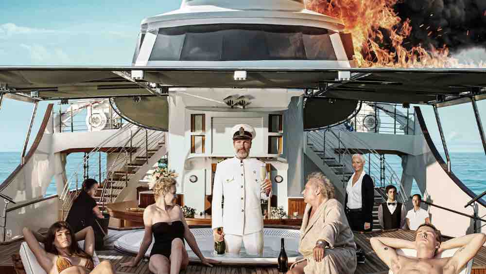
Ruben Östlund’s long-time cinematography collaborator, Fredrik Wenzel, has shot the film in vivid, rich colors. They chose to light the interior in a way that symbolizes a claustrophobic gloom because the movie travels through the world of fashion and the boundaries of relationships on a luxury cruise. The camera is mounted within the cruise. As it rocks back and forth, it mimics the motion of the water and conveys the shock and surprises the characters are about to encounter. The use of golden hue is symbolic of physical appearances serving as a cloak to conceal prejudices and biases.
17. Argentina, 1985
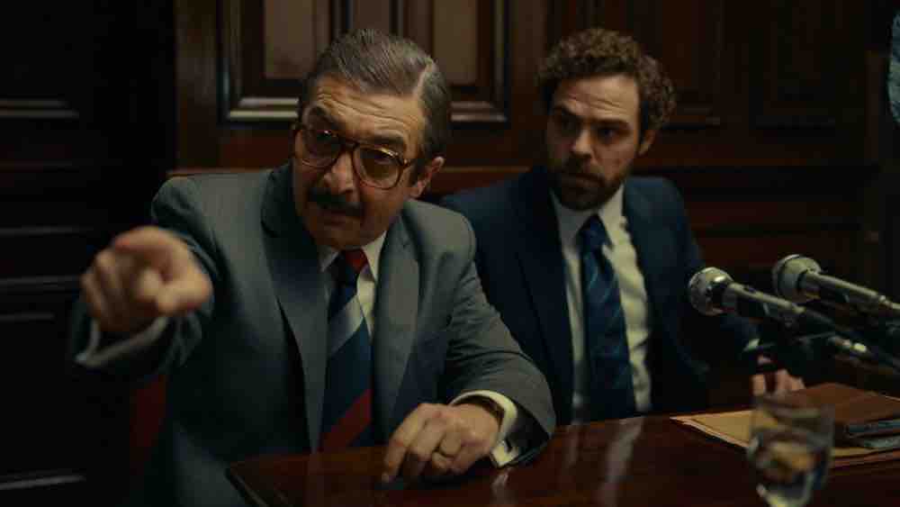
Javier Juliá allows warm tones to dominate the frames of the film with balanced and evocative cinematography. He relies on the delicate nuances of light and shade to depict an atrocious phase of Argentine history. He shot the testimony with two camera setups: an Alexa LF and the U-Matic camera, which was the same camera that was used for the broadcast of the trial. That helped him mix the textures from both the camera and his memory and bring authenticity to the trial. Such a meticulous approach resulted in a strong visual presentation, masterfully imbued with period-specific details.
18. RRR
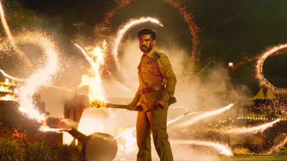
K. Senthil Kumar’s riveting use of lenses, lighting and dramatic cinematic compositions decorate the film with a heavy dose of flash and spectacle. The sequence in which Bheem unleashes dozens of animals on the colonizer antagonist is a work of cinematic visual choreography. Outstanding visual dynamics are also created by depicting the grand interiors of palaces and vast landscapes with an artistic interplay of light and shadow. While Bheem’s (N. T. Rama Rao Jr.) introduction sequence in the woods makes great use of green, Raju’s (Ram Charan’s), in the middle of a sea of protesters, makes good use of the earthy settings.
19. TAR
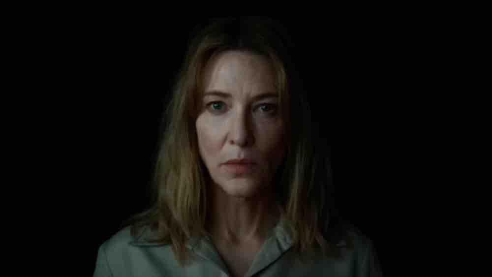
Protagonist Lydia Tár (Cate Blanchett) is introduced with an interview captured in real-time. So, from the beginning, cinematographer Florian Hoffmeister uses a static shot and puts the audience in the room. As the story moves forward, he portrays the complicated character who falls from grace through long takes and intense close-ups for intimate observation. In wide shots, he uses built-in lights to give the viewers a feel of the magnificent musical world of the protagonist. Whereas, in the close-ups, he used diffused lights to achieve a sense of authenticity. The camera placement is observational throughout, inducing lyricism.
20. The Fabelmans
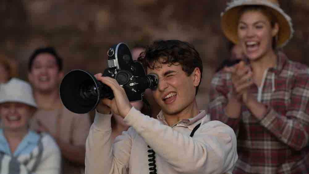
The Fabelmans is Janusz Kaminski’s twentieth collaboration with Spielberg. With a vibrant portrayal of the 1950s and 1960s, Kaminski recreates the suburbia of Spielberg’s childhood and his early forays into filmmaking on 35mm Kodak film. The nostalgic trip is a treat to the eye because of Kaminski’s highly sophisticated texture and tonal work. While creating intrigue, the cinematography strives to redefine ways of creating images and how we experience it. He brings out the flavor and authenticity of the bygone days of a period with remarkable use of lights, shades, and colors.

