It seems strange that a character as iconic as The Joker only received an origin story of sorts as recently as 2019. Over the years, The Joker has been a cultural icon. He has transcended his status as a comic book character to become a celluloid enigma. The character had first appeared on screens in the 1966 show, Batman. In subsequent years, the Clown Prince of Crime has continued to make appearances in multiple films, the most recent being Todd Phillips’ standalone story of the chaotic villain. Adapting a story about a beloved character is never easy, but the film garnered praise from fans and critics alike for its socio-cultural commentary, fresh storyline and an exceptionally powerful performance by Joaquin Phoenix.
Let’s take a look at the cinematography and visual elements in Joker.
Familiarizing the Audience
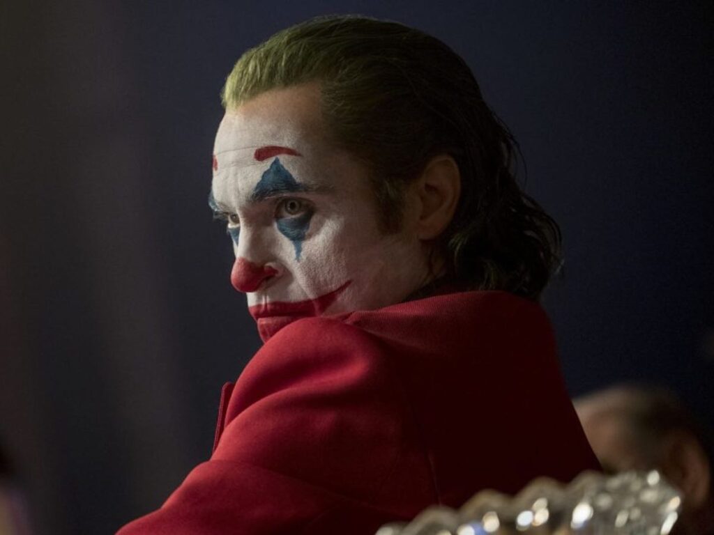
A character that looms as large as The Joker comes with a certain set of expectations. There was the issue of previous films like The Dark Knight and Suicide Squad that had previously introduced the iconic persona. Additionally, director Todd Phillips did not approach the film in the template of a comic book adaptation, rather, he tried to present the narrative as a psychological study of a deeply damaged character. Hence, it was of paramount importance to Sher to establish a visual guideline that would serve to introduce audiences to a new side of The Joker. Given that we already know how his fate turns out to be, Sher’s idea was for viewers to see the character in a way that we can both sympathize with him and still understand that he is an extremely dangerous and compromised individual.
WATCH: Who is Joaquin Phoenix, really?
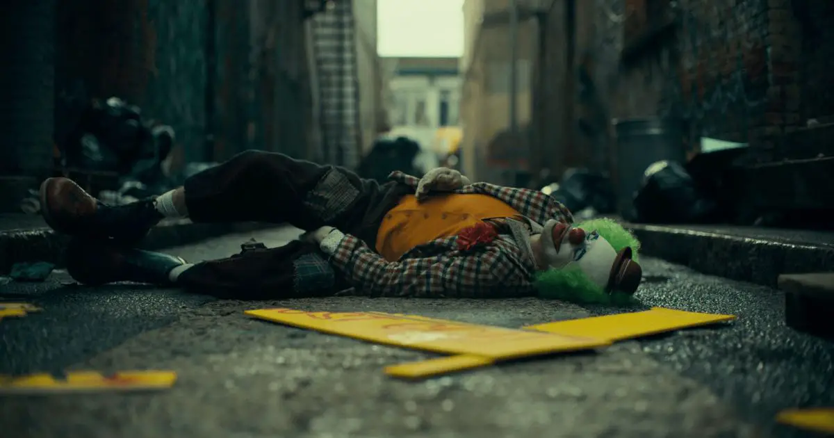
The opening sequences reinforce this viewpoint. Our first introduction to Phillips ‘Joker is not a grand, menacing entry. He has not yet transformed into a criminal kingpin. Rather, the first glance at the man behind the clown mask, Arthur Fleck, is almost pitiful and rife with a sorrowful understanding of his circumstances. The opening shot that frames him in a dingy room, and then cuts to a close-up of his reflection in the mirror while he tries to force a smile. We are then immediately shown the outside of his world, a filthy, crime-ridden Gotham City where Arthur nearly disappears into the crowd of the people. As he performs acrobatics as a clown, holding a placard, some children steal it from him and their chase ends in Arthur badly beaten and lying on the ground.
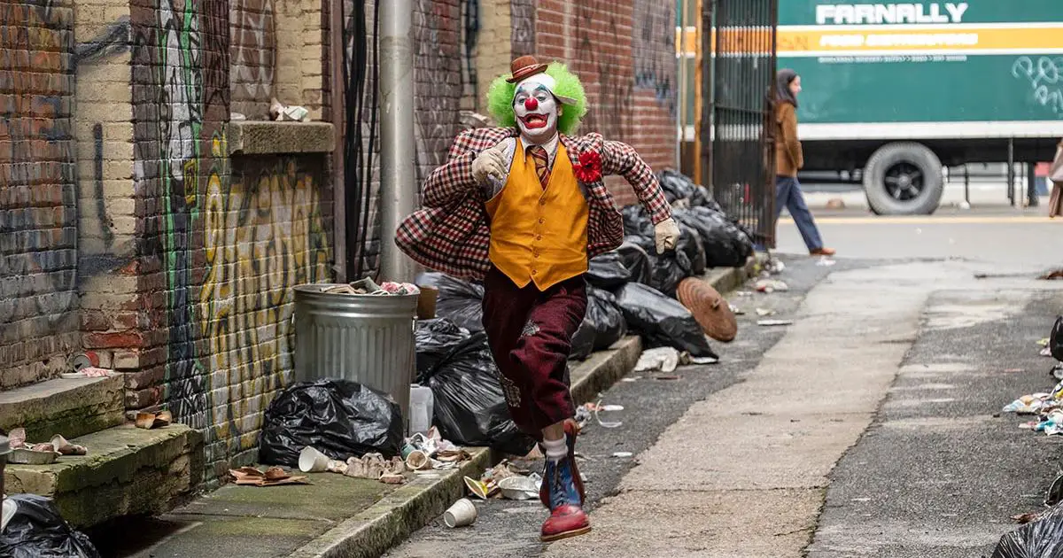
The choice to open with a sequence like this was intentional, as it displays the scope of Arthur’s world, while making the audience sympathize with him due to the extent of his harsh circumstances. While we may not root for his villainous intent, we still understand where he’s coming from. The camera, which has been following the action with a longer lens, framing Arthur as yet another individual in frames full of people and roads, cuts to a wide angled close-up of Arthur lying on the ground. The idea is to draw the audience into the mindscape of the character at vulnerable moments.
Balancing Comics and Films in the Storytelling
While Phillips did not draw any inspiration for the film from the comics of the character, one thing that he and Sher tried to emulate from the source material was the expressive style of storytelling. Since comics do not involve motion of any kind, the idea is to convey emotions and themes through the panels. Sher employs a similar method in the film. Moments when Arthur is vulnerable are presented in such a manner that the audience is drawn into his mind, and sees things from his perspective.
Consider the scene where Arthur flees through a subway station and runs into a bathroom after shooting three men who had assaulted him on the train. As he catches his breath in a run-down bathroom, the camera first moves around him to show the scope of the poverty and destitution all around him, and then settles on the mirror opposite Arthur, showing us his reflection. As he dances and sways to the music, we witness the emergence of a newer, darker Joker from within Arthur. The idea of the audience viewing Arthur’s dance in the reflection serves to put us in his shoes and turn him into a surrogate for the audience. Through the recurring motif of reflections, we only see what he wants us to, and how he wants us to.

The expressive use of silent shots and wide-angle close ups that almost imitate the style and feel of a still is to convey a similar sense of vibrant storytelling as a comic panel would. As the camera occasionally pushes in on, or withdraws from Arthur, the effect is that it documents the emotional state of the character without depicting any visible movement or without incorporating any dialogue. Long lenses that are used to show Arthur’s life in the city serve a similar purpose of visually familiarizing the poverty and despair of living in Gotham.
Camerawork
One of the major themes of the film is Arthur’s fading grasp on reality. It is hinted at in the sequence where Penny and Arthur watch his favorite talk show host, Murray Franklin. As he watches the show, Arthur fantasizes that he has been invited on the set, and Murray brings him to the stage for a heartfelt moment.
Note the sudden shift of color and lighting. Prior to his fantasy, Arthur is still swathed in the blue light from the screen but this scene employs warmer lighting that is not as stark or isolating. Subtle tonal shifts are employed so as to signal that this is not reality: all is not as it seems. The camera singles him out as a crowd, which emphasizes the disconnect from his feeling of “not being seen” in his day-to-day life. Similarly, as he is invited on stage and Murray hugs him, the camera swirls around them, further enhanced by lens flare and the lights of the studio bouncing off them. This creates an atmosphere removed from the gritty reality of the film, that subtly informs audiences that this make-believe happy meeting is all in Arthur’s mind.
Sher has said:
The conscious choice was to not put a bunch of clues in there, particularly visually, because we wanted there to be a certain level of interpretation for the audience. We didn’t want to tell the audience everything, especially because the Joker, even in the comics and other places in the past, is an unreliable narrator. He lies, he tells stories. We didn’t want to give away more of the clues.
These motifs return with his “relationship” with Sophie. Both of them are often framed in bright colors and lights, with the camera affecting a jittery movement so as to imply that these are simply Arthur’s delusions.
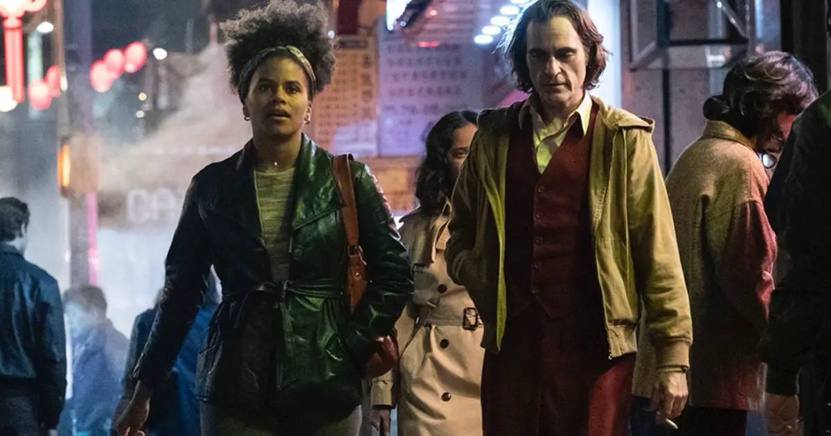
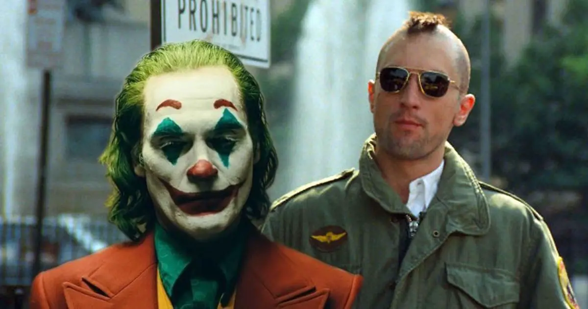
In this aspect, Joker is astoundingly similar to another film about a depressed young man failing to find purpose in his life. Martin Scorsese’s Taxi Driver. The use of harsh and grimy lighting to contrast with the appearance of feverish, bright hues that signal wish-fulfillment for the characters is a commonality throughout both of these works.
Color
Joker tells a depressing and gritty story through the expressionistic use of colors, especially blues and yellows. Arthur is regularly framed against yellow backgrounds, or in dim yellow lighting. Yellow is associated with optimism and happiness, but its darker side also hints at illness, depression, disease and madness. This creates a visual guide for Arthur’s struggle; despite his best efforts to find joy, he cannot escape his circumstances.

Similarly, his frequent moments in blue lighting also cue us into his inner depression, sadness and discontent.
Similarly, as Arthur embraces his newfound rage and fully leans into becoming The Joker, his inner anger is reflected with the usage of deep, eye-catching reds all around him. Yellow is also often paired with red in such instances to signal the connection between his madness and his anger.
Conclusion
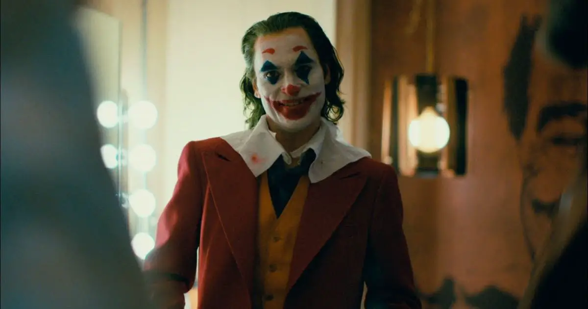
Joker is not, by any means, an easy film to categorize. It is at once a comic book adaptation, a psychological study, an origin story as well as a deeply moving human drama about a troubled man. It tells all of its disparate stories through a visual language that prioritizes the organic unfolding of its protagonist’s conflicts and desires, creating a rich tapestry of emotions. Sher’s eye for detail and an understated use of color, light and cinematography cement Joker’s place as a modern classic.

